In April New York’s Metropolitan Transportation Authority debuted a new map of the city’s subways, the first major update since 1979. As Zoe Guttenplan writes in the NYR Online, the new map is both a refreshing update and a throwback to the 1970s, when, for about seven years, lost straphangers could refer to Massimo Vignelli’s design—“a stunning modernist image, a Piet Mondrian in Morris Louis colors.” It was soon superseded by the more literal diagram familiar to city residents born after The Taking of Pelham 123, but now Vignelli’s map, with its “vibrant clusters of stripes,” seems finally to have carried the day.
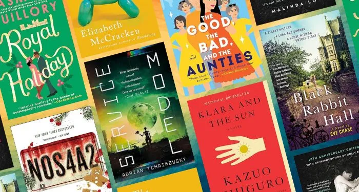
Guttenplan is a London-based designer and writer. She was formerly the lead designer for Archipelago Books, where she made the covers for books by, among others, E.T.A. Hoffmann, Scholastique Mukasonga, and Karl Ove Knausgaard. For NYRB Classics, she designed the covers for a series of Amit Chaudhuri reissues and, coming out this fall, a hundredth-anniversary edition of Virginia Woolf’s Mrs. Dalloway. Guttenplan’s writing—about literature, art, theater, and more—has appeared in places like the TLS, Apollo magazine, and Literary Review.
Last week I wrote to Guttenplan to ask her about trains, maps, and books.
Daniel Drake: As both a commuter and a designer, what’s your favorite metropolitan transit system?
Zoe Guttenplan: There are several beautiful, efficient transit systems I’ve used only as a visitor: Tokyo, Washington, D.C., Prague. They all manage to be visually striking without sacrificing functionality. We tend to think of user-experience design as something confined to screens and the digital realm, but successful design of a transit system is all about the riders’ experience. Take Paris, for example. Every building is no more than 500 meters from a Métro station—that’s incredibly practical. And those stations are beautiful too, with signs designed by Hector Guimard. As with most transit systems, there are a range of architectural styles once you get underground, but the important thing is that it’s easy to find your way.
New York and London are the only cities in which I’ve really commuted, and I love both of their transit systems for different reasons. I’ll admit to being a touch sentimental about New York’s subway, which operates exceptionally well every now and then and is beautiful in a kind of brutal way, if you don’t mind grime. London’s Underground has Victorian aesthetic charm and the attendant Victorian quirks. Some of the tunnels, lovely and round in their tile cladding, were carved out of London’s subterranean clay in the late 1800s. Those engineers didn’t leave a lot of space for heat to escape; no one would enjoy being squashed into a car on the Central line during rush hour in the summer.
You write a bit about what you call the London Underground’s “diagrammatic” map. What are some other standouts in transit map design?
Moscow Metro’s Koltsevaya line is a circular route. In the 1970s “Suprematist” design, which Massimo Vignelli spoke about at the 1978 New York subway map debate, it is represented as a brown circle that the other lines pass through. The old version of that diagram is spectacular, wouldn’t look out of place next to a Malevich or a Lissitzky, but as the Moscow Metro has evolved it’s become harder and harder for cartographers to fit all the stations that are geographically within the Koltsevaya line into the circle representing it. Singapore’s MRT map also features a circle—golden, this time—and I love the airy simplicity of this map’s thin lines and white space. There is something about the hard corners and gray background of Berlin’s transit map that seems to echo the city’s architecture; I find that pleasing in the same way as when a dog resembles its owner to an alarming degree.
In your career, have you ever worked on a map or similarly “practical” project in which the design element has a very specific purpose? How does that compare to, say, a book cover? How might you have to alter your approach?
My entry into the design world was through books. I used to work at Archipelago Books, where I started doing basic editorial tasks. But I was interested in fonts and had worked as a letterpress printer, so Jill Schoolman, the publisher, kindly let me try designing a book. I learned on the job—I’ve not had formal design training—and as a result, most of the projects I’ve worked on have been publishing-related.
But really, every graphic design project is practical in that, as a designer, your task is to present information in the most beautiful and intelligible way possible. There’s a famous essay by the twentieth-century writer Beatrice Warde called “The Crystal Goblet,” in which she argues that “the most important thing about printing is that it conveys thought, ideas, images, from one mind to other minds.” Warde’s—and, indeed, many others’—ideal design is one that disappears so that the content can shine. I don’t entirely agree with this philosophy. I think the best design is one that is clearly and immediately comprehensible but also notably beautiful. W.E.B. Du Bois’s hand-drawn infographics come to mind.
Speaking of book covers, you recently designed the cover of the NYRB Classics’ upcoming edition of Mrs. Dalloway. The idea there was to “pay tribute” to the original edition of the book. How did you decide to go with the yellow flower from the Hogarth cover? Did you have the idea to repeat it at the beginning of your process?
Designing that cover was a real treat. The Hogarth cover of Mrs. Dalloway was designed by Virginia Woolf’s sister Vanessa Bell; I knew I wanted something of her, because I think the collaboration was important to Woolf. I started by looking for paintings and prints by Bell that featured flowers—to evoke both the bouquet on the Hogarth cover and that famous opening line (“Mrs. Dalloway said she would buy the flowers herself”)—or windows. Windows come up again and again in the novel, and the Hogarth cover has exuberant yellow swooshes along the sides and top that create a scalloped edge; I have always interpreted them as folds in a curtain, perhaps drawn to reveal the railings outside. Railings—no spoilers—are also important in Mrs. Dalloway. When I found Girl Reading, a 1945 print by Bell and saw these delicate yellow petals or leaves through a window, I knew it was the right image.
Making it into a repeating pattern was always part of the plan. When Woolf and her husband founded Hogarth Press, they started out by hand-printing short stories and poems themselves and binding them in all kinds of cheerful paper. If you look at early hand-printed Hogarth books, they look kind of like NYRB Classics in that the title and author is often printed on a box in the center of the top half of the cover. Leonard Woolf thought he and Virginia had started a trend with their bindings, and I wanted to honor those early Hogarth books.
Who are some of your favorite designers? Who are some of your influences?
Na Kim, the creative director of Farrar, Straus and Giroux, designs with a such warm, witty style. I think we’ll look back on this period of book design and remember it for covers like the one she did for Sheila Heti’s Pure Colour,with the green Ellsworth Kelly nudging the bottom of the title. I’m also a huge fan of David Pearson, whose work is full of typographic joy. He has real sensitivity when it comes to recognizing, as Eric Gill once said, that “letters are things, not pictures of things.” Looking at Pearson’s covers for the Penguin Great Ideas series or John le Carré books makes me excited about design—these letter forms are about 2,700 years old, and there are still new ways to place them on a page, new games to play with them!
I’m constantly collecting pictures of typography in the wild. My friends make fun of me for stopping in the middle of the street and taking a photo of a hand-painted shop sign or an unexpected font mixture when a van pauses in front of a billboard. Then they curse me for infecting them with this disease of noticing letterforms. I’m also partway through a Ph.D. on modernist book design, so I’ve been spending a lot of time in archives; my phone’s camera roll is currently full of photos of old letterhead. Though I spend a lot of time in galleries and museums looking at art, I feel most influenced by the world around me. Sometimes I see a tree growing in a strange way or the shadows of the street railings making a pattern on the sidewalk, and I bank the shapes for later use. Or I’ll like the color combination of a brick house and paint peeling on a windowsill. It’s all colors and shapes, really.


 English (US) ·