Advertising and Marketing
Last week, we explored why beautifully crafted print editions are becoming increasingly valuable for self-published authors, as more readers look for physical books that feel worthy of collecting rather than simply reading. But once you’ve decided to create a premium collector’s edition, a much bigger question remains. What actually separates an ordinary print edition from one that readers proudly display on their bookshelf for years to come?
This week, Ginger examines an exceptional collector’s edition and uses it to uncover the thinking behind its design. Rather than focusing on flashy gimmicks, he explores how dozens of intentional decisions, from materials and typography to printing and presentation, combine to create something readers genuinely value. If last week’s article got you thinking about creating a special edition of your own, today’s blog offers a fascinating look at what it really takes to pull one off.
Last week, I wrote an an article about the bookshelf as a trophy cabinet, in which I talked about a shift happening in how readers relate to physical books. In particular, the idea that there is a growing number of fans who seek out a beautiful print edition not as their first encounter with a story, but as a keepsake of one they already love (the legions of romance readers who collect physical copies of their favorite books are becoming legendary.)
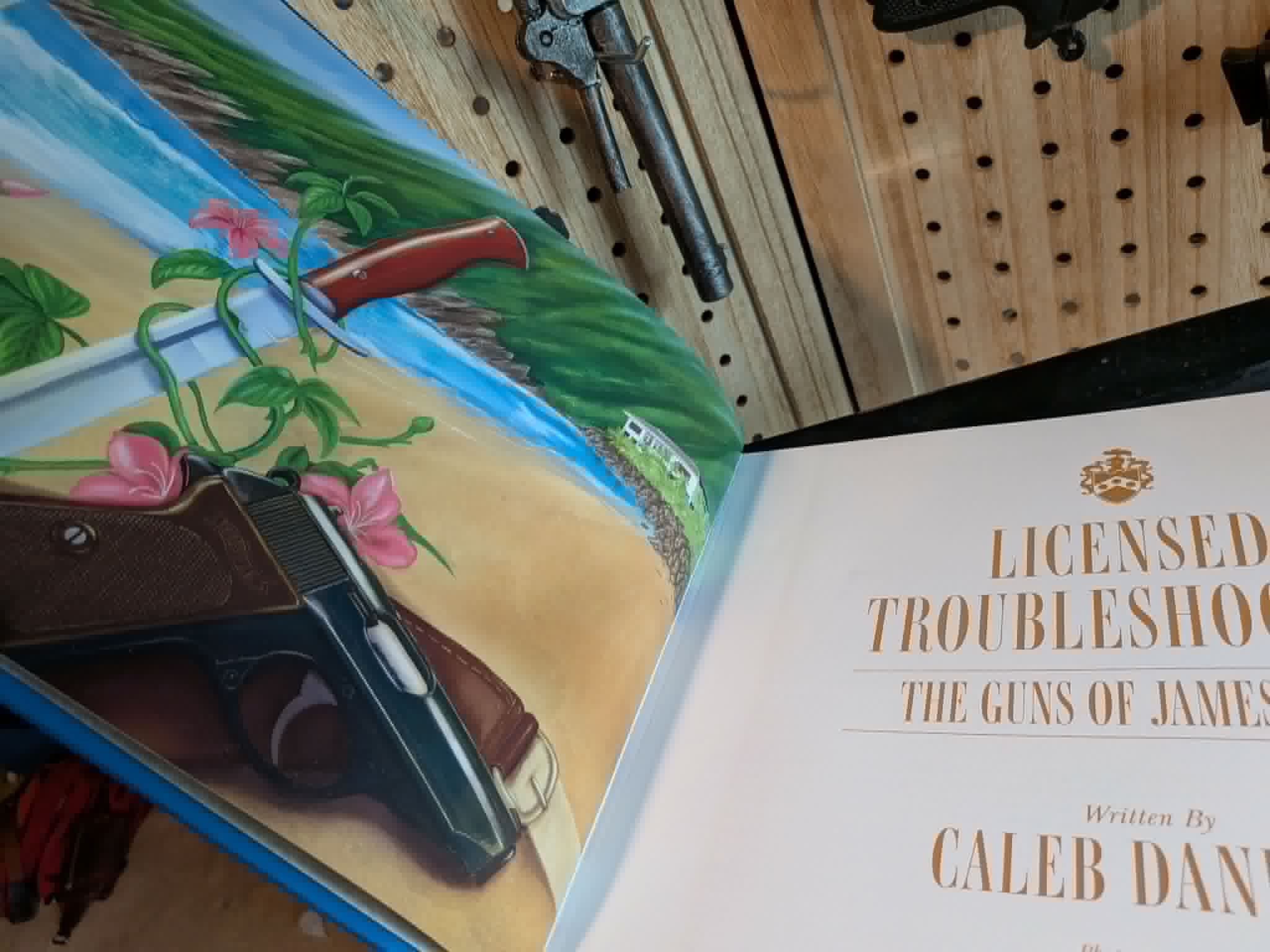
We talked about that as a concept, but a friend of Hidden Gems, Caleb Daniels, (you might remember him from ) put that concept into practice with the publication of his first book Licensed Troubleshooter: The Guns of James Bond.
(For those of you hoping I wouldn’t mention James Bond this week, I’m sorry to disappoint.)
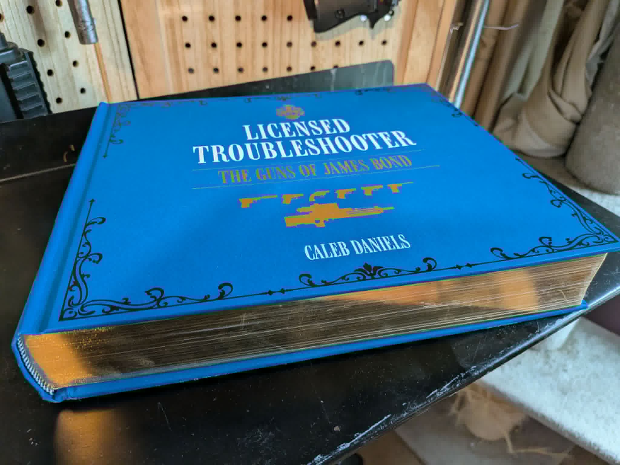
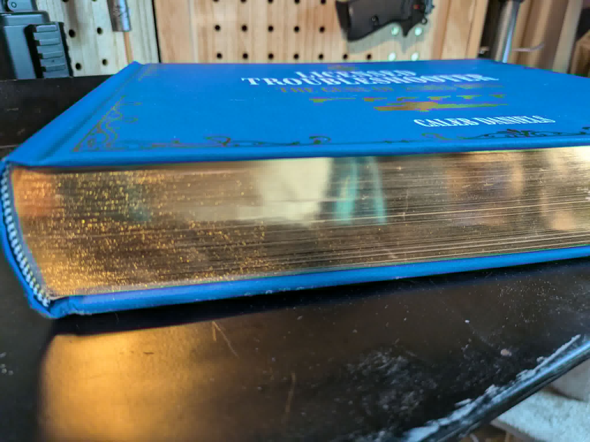
This is a beautiful 600-page, gold-edged, cloth-bound, hand-signed object of extraordinary beauty that doesn’t just demand to be read, but also demands to be enjoyed as a physical heirloom. It’s the kind of book you’ll pass onto your kids.
I want to take some time to examine this book not as a plug for it (although it’s a wonderful book, even if it’s only of interest to you if you’re into guns and/or James Bond.) Instead I want to explore what it takes to build a book that was designed, from the very beginning, to be physically owned.
It might serve as inspiration for you when considering how to turn your own self-published books into something physical. Yes, your words themselves are amazing, but your print edition can be even more than that: A lasting, tangible legacy that might be treasured long after you’re gone.
The lessons self-published authors can learn about creating elevated physical editions are considerable, and Caleb’s beautiful book is a fantastic place to start thinking about them.
Start With the Object, Not Just the Manuscript
The first thing that strikes you about Licensed Troubleshooter is its physicality. This isn’t a CreateSpace paperback. Weighing in at around 6lbs (that’s an estimate, but it’s certainly heavy enough to crush spiders) this is a book that will test the strength of most IKEA bookshelves.
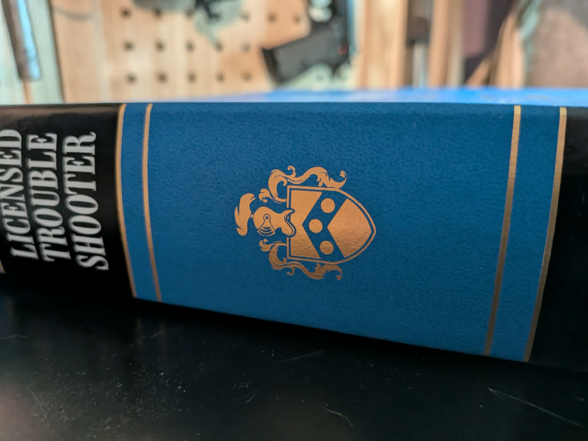
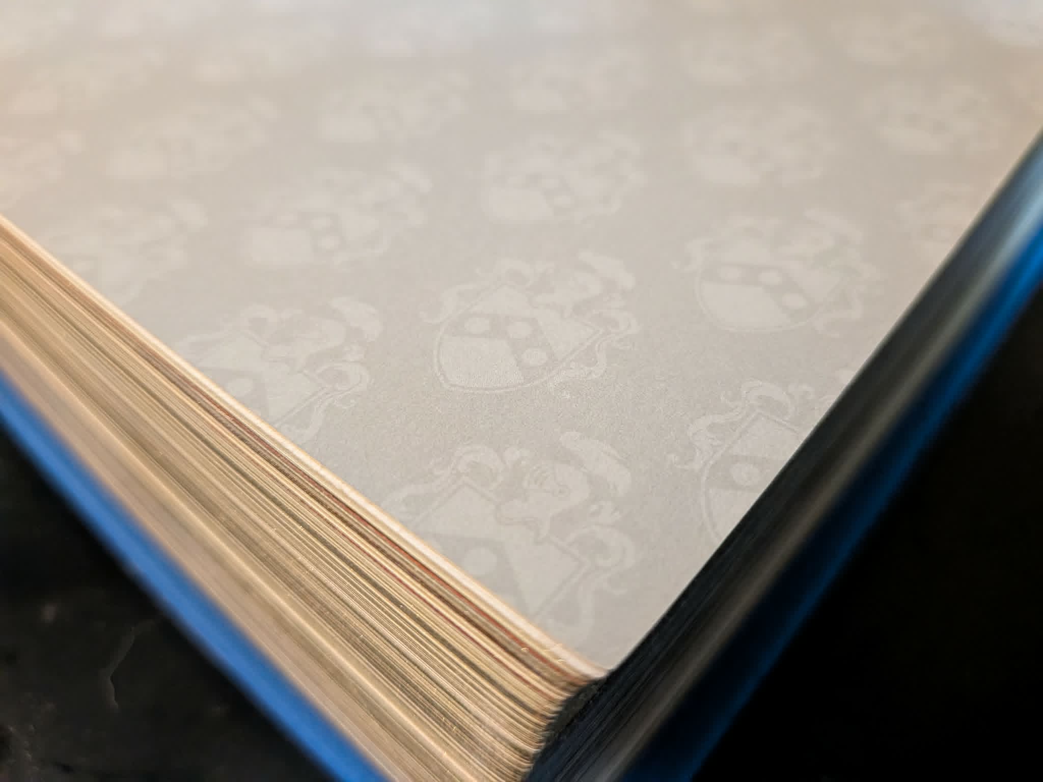
The cover is a vivid cobalt blue hardback dressed in decorative black scrollwork with gun silhouettes in rainbow-shifting foil. The page edges are gilt—not the apologetic kind that rubs off on your fingers, but a deep gold that catches the light and throws it back at you. The spine carries an embossed gold crest familiar to all James Bond fans, it’s his actual family coat of arms, as established in On Her Majesty’s Secret Service. Open the cover and you find the custom endpapers embossed with a repeating pattern derived from Bond’s heraldic motif.
None of this happened by accident, and none of it was handed to Caleb by a publisher who knew better. It was the result of him being a passionate James Bond fan who came to the table with a clear creative vision and the confidence that Bond fans like myself would absolutely adore these tiny “easter eggs” he had the thoughtfulness to include.
Although Caleb’s book was published by Headstamp Publishing, one of the most exciting and innovative independent publishing companies operating today, he had immense creative flexibility when it came to designing the book because the publishers had confidence in Caleb’s vision—the kind of creative freedom only self-published authors like ourselves normally enjoy (and it shows.)
“I know I’m getting access to things that most authors don’t get the luxury of doing,” Caleb told me. “Most people just deliver a manuscript and what they get is what they get.”
Instead, Caleb’s work wasn’t even close to being finished after completing his manuscript. That was the moment he turned from writer to designer, and that’s the first lesson to learn from all this.
If you want a book that functions as a collectible, you can’t be passive about the physical design. You have to be in the room and work hand-in-hand with your printer or publisher.
Every Detail Should Mean Something
What separates a truly exceptional physical book from a simply attractive one is intentionality. The details in Licensed Troubleshooter don’t exist for decoration, they exist because someone who understood the subject matter thought carefully about what would resonate with the people most likely to treasure the book.
For example, the font used for the title and all chapter headers across the book’s nearly 600 pages is a custom-designed distressed serif that Caleb asked the graphic designer to build from scratch. He sent over a collection of original 1960s Signet paperbacks—the very editions that first introduced many readers to Ian Fleming—and said: this is what I want it to feel like. Making a book published in 2026 feel as though it could have sat on a shelf in 1965 was, in Caleb’s words, “really important to me.”
Throughout the book, each chapter heading carries a small gold silhouette of a firearm relevant to that section, a quiet navigational detail that readers who know Bond will recognize with a smile and readers who don’t will simply enjoy as elegant design.
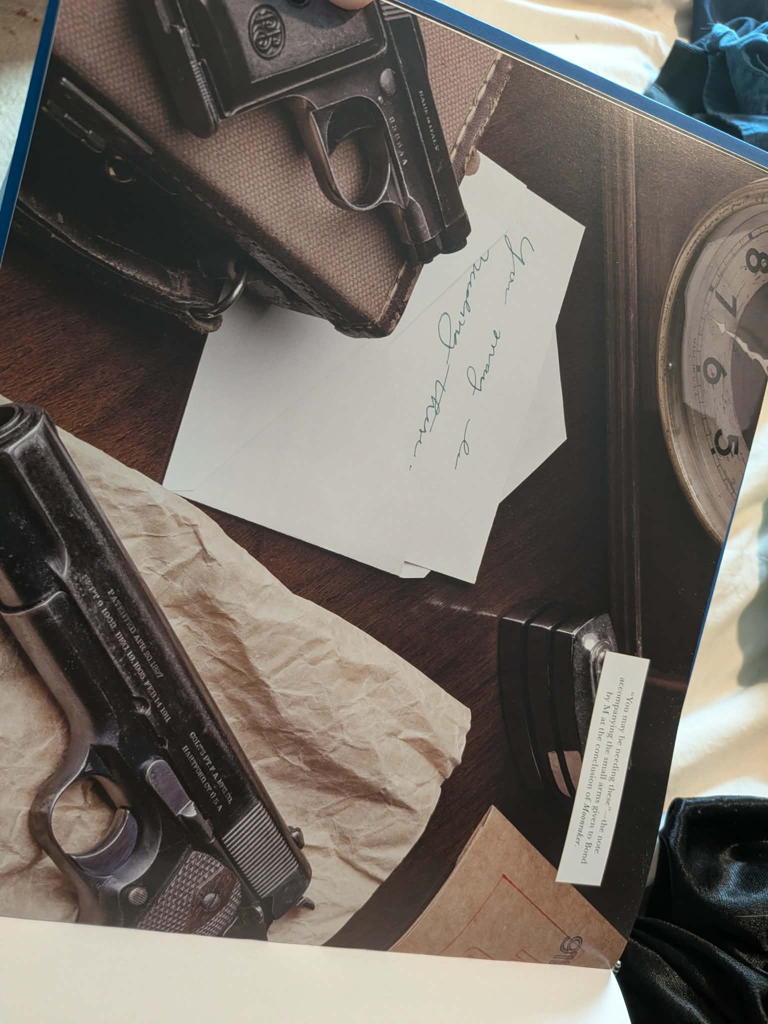
I mentioned before how the endpapers carry the Bond family coat of arms worked into an all-over pattern, but the signed collector’s edition takes that further, featuring a special tip-in page designed to look like a redacted intelligence document and a blue leather bookmark with the WA2000 sniper rifle from The Living Daylights stamped across it in embossed gold foil.
The accompanying ex-libris card is similarly inspired by a Casino Royale playing card and carries a suppressed Beretta on one side and a suppressed PPK on the other.
“I want them to smile when they see little things on the page,” Caleb told me, “because Bond fans will recognize something that no one else will recognize.”
That sentence is the design philosophy for the entire book, and it’s transferable to almost any genre. The details that mean the most to your most devoted readers are the ones worth fighting hardest for.
The Interior Is the Product Too
It’s easy to focus on covers and edges, but Licensed Troubleshooter is a reminder that the interior design of a physical book is just as important, and just as often neglected.
Caleb’s book uses sewn-signature binding throughout, which means every page opens flat, edge to edge, without the gutter eating into photographs. For a book built around large-format gun photography, this isn’t a luxury, it’s essential.
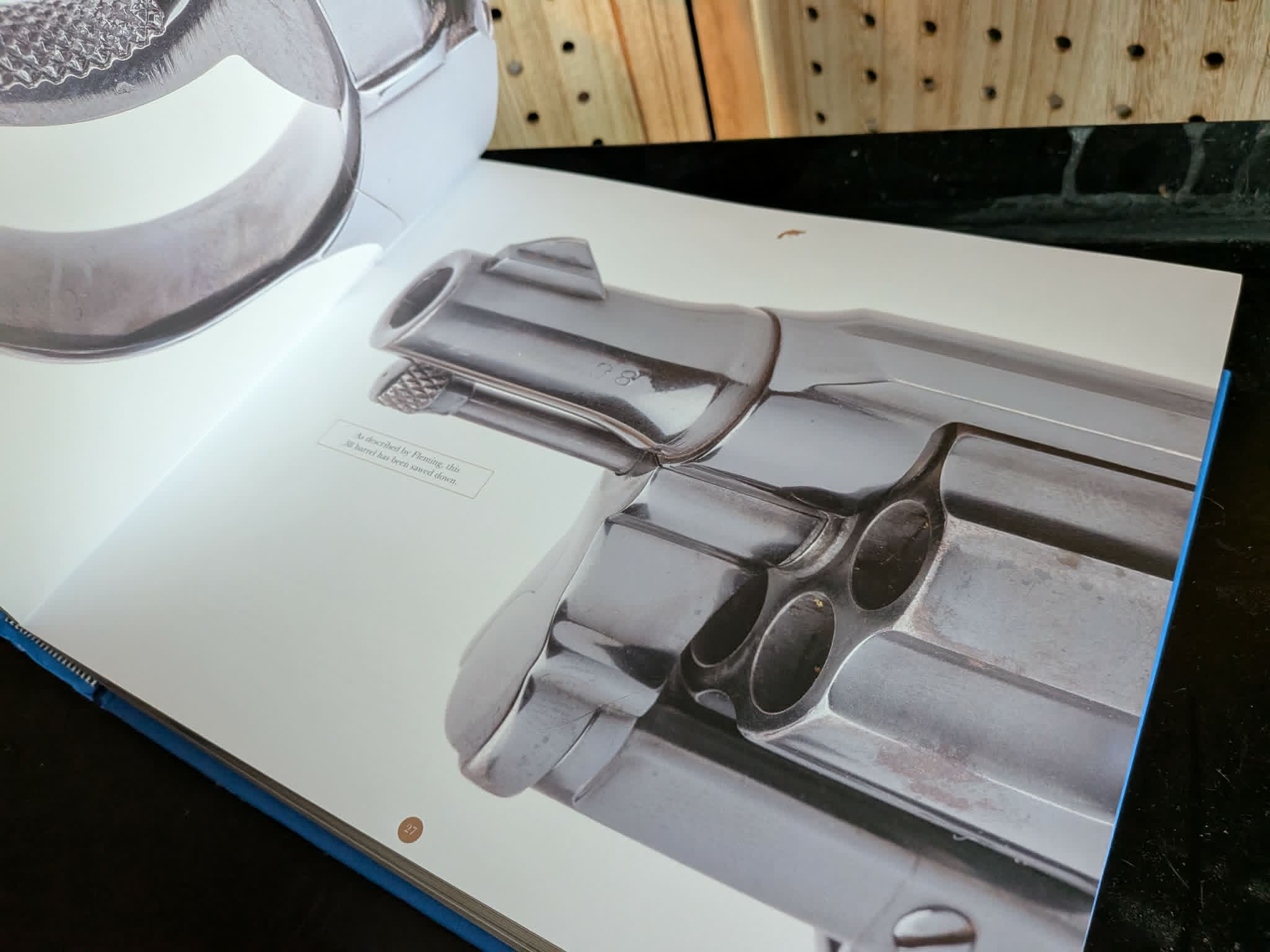
The photography itself, some of it by Caleb himself, but the majority by renowned firearms photographer James Rupley, is printed full-bleed across pages the size of a quality coffee table book, and the paper stock is chosen to make the images sing rather than merely appear.
What makes the interior photography particularly remarkable is that it’s a collaboration. Caleb contributed many of the lifestyle images himself—staging, lighting, and composing shots that carry the atmosphere of the book—yet worked closely alongside Rupley so that the two bodies of work feel completely seamless on the page.
One of the most striking examples: A flatlay recreating a scene from the Fleming era, with a World War II-era US Naval notecard (from Caleb’s great-grandfather’s collection), was written in green ink by a calligraphy expert who perfectly matched the wartime handwriting of Fleming’s actual intelligence chief. That detail, seen sitting alongside period-correct firearms and a Ronson desk lighter, makes a simple photograph something magical.
“I just wanted it to feel like something I had already been doing,” Caleb told me. And if you’ve been following his work on Instagram, you’ll instantly see that the photographs in his book weren’t a departure from his previous years of work, they were a continuation.
The Printing Fight Is Real, and Worth Having
Here is where many authors would have taken a shortcut, and where the story of this book becomes most instructive for anyone planning a premium physical edition.
There’s a big challenge facing those who want to produce a physical copy of their book. It’s an even greater challenge if you want to put more thought and intentionality into it than Createspace or IngramSparks offer. You actually have to find a printing partner to work with.
In the case of Caleb’s book, Headstamp Publishing already had some trusted and proven partners to work with, but even then, the journey from PDF to bookshelf is not a straightforward one.
For example, Licensed Troubleshooter was ready to go to press in early 2025 with Headstamp’s trusted printer for large-format books in China. Then, Trump’s infamous tariff escalations began, and a potential doubling of printing costs (on books that were already expensive to begin with) made the arrangement suddenly untenable.
With impressive agility, Headstamp quickly moved to a printing partner in South Korea. The printer had handled smaller Headstamp titles, but had never dealt with a volume this size—nearly 600 pages, printed on heavy photographic paper, with sewn binding. They struggled. Worse, the collectors’ edition came with a linen clamshell presentation box, and the printer produced them too large, leaving the book to shift freely inside during the long freight journey across the ocean. Corners were destroyed. Boxes were unusable. The result was a delay of nearly twelve months.
However, as the copy of the book I’m in possession of proves, that was a delay, not a roadblock. Even then, though, the situation was far from ideal.
“I was unable to talk about something I was incredibly proud of for the better part of a year and a half,” Caleb told me. “I just had to patiently wait.”
That wait was, by his own account, a test of commitment—but neither he nor Headstamp were prepared to accept a compromised standard. Caleb wanted his first book to wow those who’d supported him in publishing it. Headstamp had a hard-earned reputation to maintain. It had to be perfect, and it had to be on budget. That meant paying the extra money for the tariffs was a non-starter and the damaged clamshells weren’t going to be acceptable. If the book was going to exist at all, it was going to exist correctly.
Fortunately, the end product vindicates every day of that wait, and the lesson to be learned is blunt:
If you’re building a premium physical edition of your book, the printing is not a commodity decision. The quality of the print partner determines the quality of the book. Cheaper, faster, and more convenient will show on every page. If you want to earn book sales because of the quality of your printed books, you need to get that component right, even if it takes longer.
Price It Like What It Is
Quality doesn’t come cheap. The standard edition of Licensed Troubleshooter retails at $110, which is a pretty eye-opening amount for those of us who normally shop for printed books at Barnes and Noble. The signed collector’s edition runs to around $125, meaning these books aren’t impulse purchases!
However, the price is exactly right for what the book actually is.
When I held my copy of Licensed Troubleshooter in my hands for the first time, my immediate response wasn’t to think about the price, but the extraordinary value that price represented. The book wasn’t cheap, but it delivered on every promise. For the cost of five paperbacks from CreateSpace, I got an absolutely stunning, beautiful book that is perfect in every painstakingly considered detail and a treasure to behold.
That’s the psychology of the trophy book working exactly as it should. Your readers should never be comparing the “value” of a printed book to the $15 eBook version (not that such a thing exists for Licensed Troubleshooter.)
It’s a completely different product, a different concept, in fact. Taking this approach means wanting to produce a book that your readers will want to own for the rest of their lives (and possibly even pass onto their children.) When you frame it like that, $110 isn’t just great value for money, it seems like a damned bargain!
The signed edition sold through Kickstarter first, with special cover variants—a literary Bond edition and a cinematic Bond edition—also available exclusively to backers. This tiered approach, moving from Kickstarter exclusives down through collector’s editions to the standard retail version, creates a natural hierarchy of ownership that rewards the most devoted readers while keeping the book accessible to a broader audience.
(You might want to listen to our for more information about the opportunities available for launching a book through crowdfunding.)
The Trophy Book Is a Different Thing
Licensed Troubleshooter is a remarkable achievement, but it’s also a demonstration of approaching publishing in a completely different way to how we normally discuss it on Hidden Gems. This is a book conceived as a collectible from the outset, which will always be more successful as a collectible than one retrofitted into the role.
Caleb didn’t write a manuscript and then start thinking about how to make it look nice. He visualized the concept, filled it with authoritative words, and then fought for the font, the endpapers, the binding, the clamshell, the bookmark, and the ex-libris card.
He spent hours on calls with layout designers. He sent physical reference materials across the country so a graphic designer could capture the right “feel” of the book, knowing how much of a difference those little details would make to his eager audience of Bond fans. He even waited twelve extra months rather than accept a compromised print run.
“This is meant to be an heirloom piece,” he told me, and simply by looking at the book, you can tell he meant it.
You can feel the weight of that effort in the weight of the book, and see the value reflected in the light bouncing off those golden page edges. Yes, it’s a must-own collectible for James Bond fans, but this book is also a shining example of what’s achievable for any author thinking about how the physical edition of their book could become more than just the heartfelt words they poured into writing the digital version.
Putting together a really special physical copy of your book is something every self-published author should consider at least once in their lives. It doesn’t just elevate your written work, it also elevates the experience of why you became an author in the first place.
Share this blog
About the Author
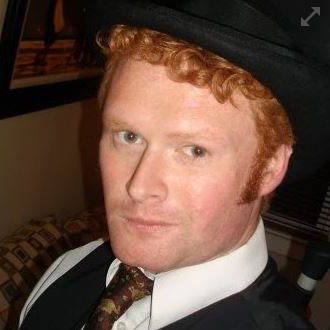
Ginger is also known as Roland Hulme - a digital Don Draper with a Hemingway complex. Under a penname, he's sold 65,000+ copies of his romance novels, and reached more than 320,000 readers through Kindle Unlimited - using his background in marketing, advertising, and social media to reach an ever-expanding audience.


 English (US) ·