Advertising and Marketing
As authors, we’re often balancing our creative principles with the need to embrace new technologies that might boost book sales. That’s why, after recently expressing his dislike of AI-generated art in book ads, Ginger decided to run a small experiment to see how effective these ads truly are.
By comparing ads using AI-generated artwork with a similar set featuring traditional art, he was able to draw some surprising conclusions. While this sample size is small and not meant to prove anything definitively, the results could be useful for any authors still debating whether to stick with traditional imagery or explore the AI route in their marketing efforts.
A couple of weeks ago, I published a rant about how much I loathed seeing ads for eBooks in my Facebook feed that used AI-generated artwork, and it seems from the responses that many of you agreed with me!
However, the debate raised one important question that I didn’t have the answer to: Whether or not the ads worked effectively.
Because at the end of the day, that’s a major consideration for authors – especially when we’re struggling to sell products that often only have a tiny profit margin. I recently increased the price of my books on Amazon, but previously I’d been retailing them at $3.99, which meant I only made $3 in royalties with each sale. My traffic ads would normally generate one sale for every 12 clicks, meaning I had to keep my Cost-Per-Click below $0.25 to make a profit.
Would AI-generated artwork produce cheaper, more effective ads?
In the interests of science, I decided to find out – and share all the results with you. That being said, I am still opposed to the idea of using AI-generated art in my ads – I just thought that it was worth finding out the answer for myself.
How do you create AI-generated art?
AI artwork is a massive thing right now, and there are all sorts of sites you can go to and type in prompts to generate AI art. Alternatively, the tech-savvy amongst us can download all the components to make our own AI-artwork system, which isn’t burdened by some of the restrictions that commercial providers impose.
I’m fairly technically savvy, but not on the same level as Craig, so I took the easy option. I have a monthly subscription to Adobe’s Stock Photography service and they now offer the ability to generate AI artwork within that service. I decided to start there.
(As a quick aside, I hate the way Adobe now has so many AI-generated photos and pictures in their Stock Photography catalog. I normally filter them out, because otherwise at least 50% of the pictures I search for end up being generated by AI.)
I write MC Romance books, so I asked Adobe to generate some muscular heroes for my ads, and the results were actually astonishingly good. I was genuinely surprised how realistic some of the images were and one in particular looked so much like a muscle-bound friend of mine that I even sent a copy to him!
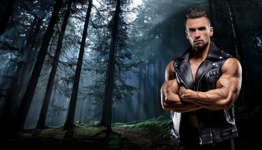 I used to bartend with a guy who looked like this – although his arms weren’t quite so freakishly vascular.
I’d say the majority of the pictures that were generated didn’t pass muster. Some of them didn’t look like real human beings. Sometimes, they had incorrect details or backgrounds. By far the most common issue I ran into was generating pictures of people who didn’t look like the characters I was trying to make images of – I’d ask for a “muscular blond biker” and get a vividly realistic African-American biker with peroxide blond hair, for example (maybe he could be character inspiration for another day.)
Ultimately, though, I was able to generate enough pictures to make this experiment viable and go to work making some ads.
Creating Facebook Ads
When you run Facebook ads, you generally need three sizes to hit all the potential placements. A square image for the general Facebook and Instagram Feed, a portrait style one for Reels and Stories, and a landscape one for the Right Sidebar and News segments.
I have a template I’ve used for ages which generally delivers good results. It features a mockup of an Amazon Kindle with my book cover on the display, and I add the stock photography as a backdrop. That’s exactly what I did here – creating four ads for four books, each in the three different sizes.
This actually took some artistic skill, I’m not going to lie. I’m pretty handy with photoshop and not only did I create the three differently-sized ads, I also added some tattoos to my hunky heroes to keep them consistent with the covers and “brand” of my books.
 I added the tattoos myself – and it’s worth noting that the handsome stud on the cover of the eBook is NOT AI-generated.
I believe AI can automatically add tattoos when it generates pictures, but they’re typically abstract types of letters and artwork and I wanted real-looking tattoos, so I used stock photography I’d used for previous designs using real, human models.
 These are some of the ads I’ve created using real-life, non-AI stock photography. I prefer them!
Perhaps this was cheating, since AI-generated tattoos would have definitely been a giveaway that this wasn’t a real human being in the ads – but I have some standards I don’t want to compromise on. That being said, I wasn’t trying to deliberately mislead anybody. I didn’t want to trick people into thinking these were real models in the photo – but the integrity of the experiment also required not making it too obvious.
Creating Video Ads
Once I’d created my ads, I took it a step further and created animated versions of them. This is something I do with all my regular ads, since video doesn’t tend to be very effective on Facebook. I used a program I paid for a number of years ago that adds pre-rendered overlays to my images to make it look like it’s pouring with rain, smoke is wafting across the screen, or sparks from a fire are billowing up in front of the images.
I made each video run for 12 seconds and made a version for each size across all the ads that I made – a Story version, a Square version, and a Landscape version.
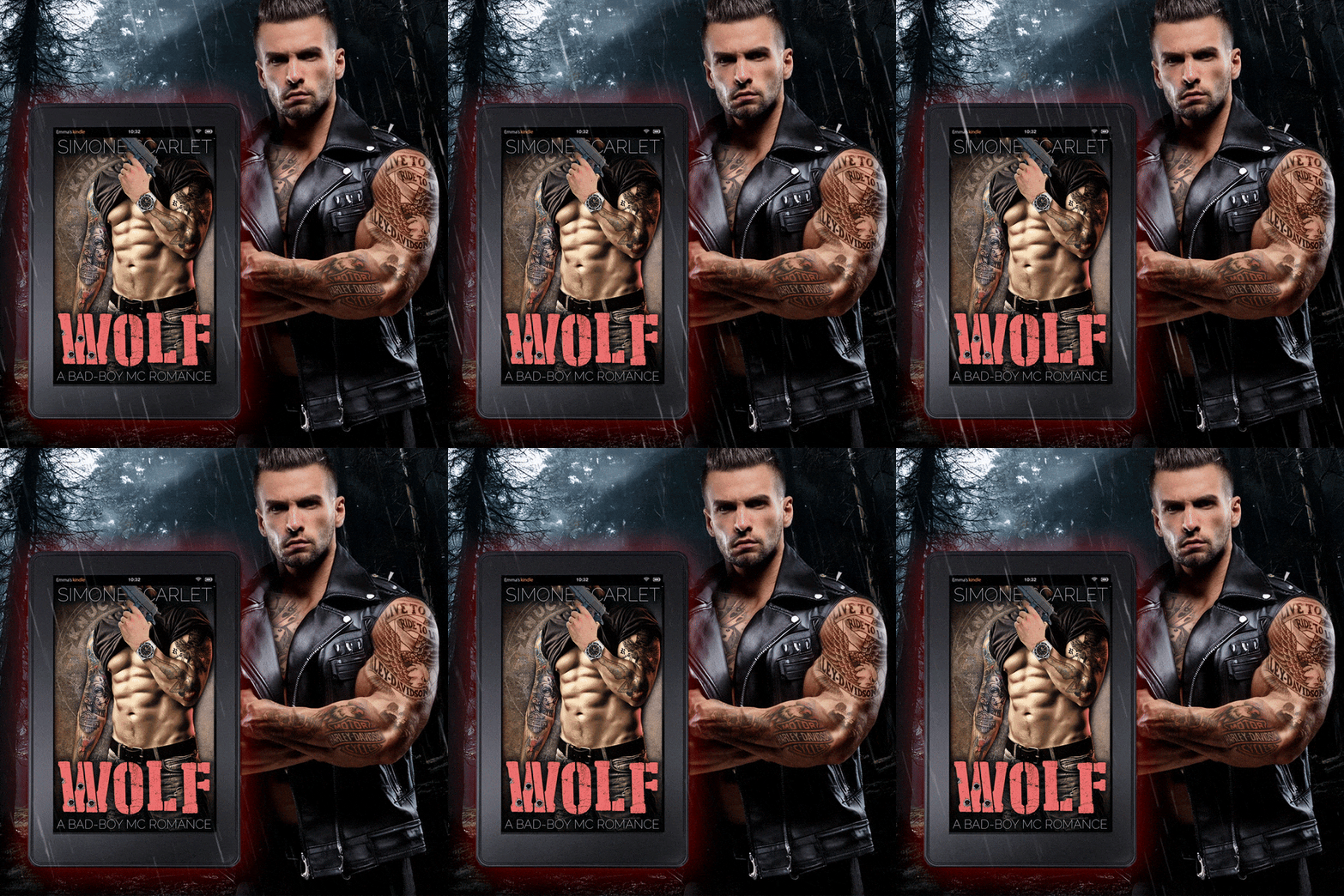
I really liked the look of these ads! I still felt a little squeamish about using AI-generated art instead of real pictures of actual models – but at this stage of the process, I was becoming uncomfortable with just how good my ads looked.
I hadn’t expected the whole process to come together so easily. From generating the models to animating them, making AI ads was actually easier than making regular ads since I didn’t need to do so much Photoshop. My AI-images were pre-rendered in the right proportions, with appropriate backgrounds, and I just needed to crop them and add small details like the tattoos. The whole process was much quicker than using regular stock photography.
(As I said before, I was getting really squeamish about it at this point.)
Running the Ads
After I’d finished rendering the video versions of my ads, I added them to a brand-new campaign and decided to face them off against a series of ads that I’d run previously with great success. My older ads were all generated with real, live humans as the models (and real life locations from stock photography.) I’d used the same methods to generate these ads in different sizes, and made video versions of all of them, so I thought this was a fair comparison to experiment with.
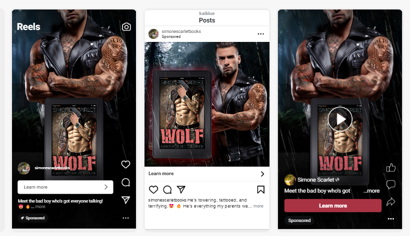
I decided to run a Traffic Ad campaign rather than a Sales campaign, like the ones I normally use to direct potential customers to my direct sales funnel. Traffic ads give you the opportunity to reach a much broader audience much more cheaply, which was great since I was more focused on comparing the ads than making sales with this experiment. I set the ads to switch off after the same number of impressions, giving each of them the same opportunity to reach the same number of people.
Then, heart in my throat, I set them to run.
What were the results?
After a day of running the ads, I had enough information to compare the “real” artwork to the AI-generated art. The results surprised me.
I used the metric of Click-Thru-Rate to judge the effectiveness of each ad, since that compared the number of Impressions to the number of Clicks, effectively ranking just how engaging and click-worthy the ads were.
Six ads performed significantly better than the others – but surprisingly, three of them were AI-generated and three of them were made using regular stock photography, meaning there wasn’t a clear winner between AI-generated art and the regular kind.
Five of them were video ads, however – and the rest of the video ads also performed better than the static image ads I’d created, regardless of whether or not the original artwork in them was generated by AI or not.
In fact that one rogue outlier, the static image ad that made it into the top six (it was #4, actually) was created using real-life stock photography, not AI-generated art, so it didn’t make the results between the two any clearer, either!
But what did seem clear was that video ads definitely seem to outperform regular static ads. They consistently seemed to get more impressions, a higher click-thru-rate, and result in a lower cost-per-click.
Conclusion
I was surprised, but also a little reassured by the fact that AI-generated art didn’t immediately and dramatically outperform the real-life images and stock photography I’d used in my ads.
Perhaps I’d muddied the waters a bit by adding real tattoos to my handsome hunky heroes, or maybe the AI-generated artwork I’d chosen had just been too realistic – maybe people couldn’t tell the difference! In any event, it wasn’t the artwork that really made the difference – it was the animation.
Videos, it seems, really are the way to go when creating and running Facebook ads. The movement seems to make people more likely to stop mid-scroll, and that gives them enough time to read your copy and click on the “Learn More” button.
(The copy in both sets of ads was identical, by the way, to ensure a fair comparison.)
That’s why I’m definitely going to make sure I make video versions on all my ads moving forward.
That being said, however, I’m not abandoning my static ads. Not only did at least one of them perform comparatively to the video ads, but none of them had performed badly by any stretch of the imagination. I think there are definitely going to be circumstances in which a static ad might be a better option (in the tiny landscape ads in the news feeds, for example) and in general it’s good practice to have more ads in your campaign rather than fewer.
And for the time being, at least (and ideally the foreseeable future) I’m going to continue trying to avoid running ads involving AI-generated art.
The quality of AI-artwork is continuing to improve at a ridiculous rate, and even the art I used for my ads was difficult to differentiate from real stock photography. However, I have too many friends who are models and photographers to be willing to abandon real stock photography anytime soon.
And the good news, in the short term at least, is that the metrics seem to indicate I won’t lose out by sticking to my principles in this regard. The real question, however, is how long that will last.
What did you make of this experiment?
I was inspired to run this experiment after seeing so many comments (and emails) on my last article about AI-generated art in ads, and I’d love to learn what you thought about this one.
Were you surprised by the results? Relieved? Will you be experimenting with AI-generated art in your own ads, or sticking to your guns and only using “real” photography like I intend to?
We’re voyaging deeper and deeper into a brave new world for creative folks, and I’d love to learn where people stand on the issue. Please don’t be shy about putting your opinion into a comment down below.
Share this blog
About the Author

Ginger is also known as Roland Hulme - a digital Don Draper with a Hemingway complex. Under a penname, he's sold 65,000+ copies of his romance novels, and reached more than 320,000 readers through Kindle Unlimited - using his background in marketing, advertising, and social media to reach an ever-expanding audience.









 English (US) ·